

Behind-the-Scenes: Creating an Iconic Cover for BECAUSE FAT GIRL
From "vibe check" to "holy $#@! this is absolutely perfect" – here are the four steps my publisher and I went through to create the fabulous and instant classic cover for BECAUSE FAT GIRL.

Please judge a book by its cover.
Especially my book.
Because damn, that’s a sexy, genderqueer, proudly fat and fabulously femme cover right there!
If you haven’t seen it yet, you’re about to!!!
But first, let’s talk about the book cover process:
I was warned I would have no input at all.
One thing I’m quickly learning about the publishing process is that everyone’s experiences vary greatly depending on three things:
The publisher’s policies, practices and budget in that particular season/quarter.
How much weight and marketing the publisher is going to put behind their book.
Resilience and confidence to stand up for your vision and ask for what you want.
(I can’t help you with the first one, that’s sometimes just luck of the draw. But if you want help with #2 and #3, check out my Write Your Friggin’ Book Already® program, which not only helps you write, edit, and publish your book, but also supports you in building out the platform publishers love to see.)
It’s been two decades since I first started on my publishing journey, and in that time I have built the connections, platform, marketing skills, and confidence to know what is right for me and my book.
And I am so very lucky that I ended up with a publisher and team that value my input and trust my skillsets (thanks Entangled!).
Perseverance + building skillset + luck = success
I am extremely lucky I ended up with a fabulous team who believes in this book and wants to put their whole might behind it. And, I spent two decades building up the skillset needed to not only write a powerful book, but to write it for the market I know will love it. And I didn’t give up when I was rejected many many many times in the past.
I say all of this, because going into the publishing process, I was more empowered than most authors. Including when it came to the book cover.
I knew the essence of my book artistically and wove it through each chapter. (See my upcoming post on essence for more about that.)
I know the market for this book intimately because I wrote it for my community.
I am able to articulate both the essence and the market in everything I do around this book.
I kept coming back to essence and market in all our conversations about this book, relaying what I knew to my publisher, so we could all be on the same page. Which meant that when they showed me cover examples, they were already spot on, knowing the vibe of this book from the start.
Step One: Inputting my preferences, hopes, and dreams for this cover
My publisher, Entangled, has a whole process for gathering information from their authors about their likes, dislikes, and vision for their book cover.
Here are some of the things I shared with the art department before they started:
I love big bold fonts and want the title to take up most of the cover. Here’s my thinking behind that:
People shy away from the word FAT but I want it out there proudly. And I’ve never seen a contemporary romance novel with that word on the cover. That alone will pull in readers (especially because *EVERYONE* has strong feelings about fat girls.)
There are so many books I know and love the covers but couldn’t tell you what the title is. Having the title part of the cover art will help people remember the book more.
Notice both essence and market are represented and thought about here. Learn how to define both while you’re writing your book in my Write Your Friggin’ Book Already® program.
I want it to feel like queer femme fashion, like the main character.
If there is a person on the cover, I want it to be just the main character, and I want her to be fat, or at least take up a lot of space. For this, they had me describe the main character, Diana. Here’s how I did:
Body type: Plus-size, curvy, hourglass figure, about a size 16-18
Personality: Sassy, passionate, not always saying the right thing, driven, ambitious, loving and kind but also can fly off the handle
More: Hair that hits between her chin and clavicle, loves high fashion even if she can't always afford it, confident appearing, but deep down worried her queerness and fatness will forever keep her from her movie making dreams, still she's willing to push through and try. She is queer and has identified as a lesbian her whole life. Now, she's reevaluating whether she's more bisexual than she realized as she falls for a cis-man.
Want to read more about her and this book? Go to BecauseFatGirl.com for the Insider Packet!
Finally, I wrote a little letter to the artists:
I like the idea of big and bold. Something that would stand out on the shelf, not like other books near it. While it is definitely romance, the main story really is about how Diana won't give up on her dreams, how life didn't turn out how she envisioned it but it might actually be better this way, and how the group of friends come together to make a movie. I want it to fit equally on a commercial fiction, women's fiction, or romance shelves. I love cheesy and sentimental romance novels, but this book isn’t cheesy or sentimental, it’s sassy, empowering, fashionable, and a true Hollywood ending. I would love for that to be conveyed.
I filled out that form, said a little prayer to the publishing gods, and then sent it to the Entangled art team.
Step Two: The Vibe Check
There is this big fancy festival of books in Frankfurt, Germany every year where publishers pitch upcoming books in hopes of getting international distribution.
It’s called the Frankfurter Book Fair, or Buchmesse in Germany– which I am pronouncing book mess even if that is not correct. I imagine it like the stock floor with bids flying everywhere, people screaming at each other, and scraps of books littering the floor.
Except it’s probably super chill and no one would actually rip up a book because OMG who would do that?!
For Frankfurt, my publisher wanted to put together a little blurb about my book to showcase it to foreign rights distributors. With that blurb, they wanted a book cover placeholder that had the essence we were going for with Because Fat Girl.
Here is the cover they presented to me “for a vibe check”:

I saw this and thought “hell yes! they get it!” Big bold font. Fun funky colors. Yes!
It was the perfect vibe.
So they went off to the Book Mess and showed it off while I waited for a more complete mockup.
Step 3: The First Full Draft Cover
A few months later – publishing is a hurry up and wait kind of industry – I had a meet and greet with the whole marketing team at Entangled which was wonderful because they’re a great group of humans, but also because they showed me the next ideation of my book cover!
They prefaced it by saying it was hard to fit “Because” on the cover in correlation with “Fat” and “Girl”. So they tried changing the title to fit better.
Here’s what they showed me and my team:

The vibe was so obviously me! We all had a good laugh about how my shirt matched it perfectly.
But BECAUSE FAT GIRL was chosen as the title for a reason. There’s a whole social commentary that goes along with it. (Go to BecauseFatGirl.com and become a BFG Insider to get a sneak peek and find out what that meaning is.)
Hey Fat Girl as a saying also had cultural connotations, ones that felt more like appropriation than appreciation.
So while the vibe and look and feel was so spot on for this cover, ultimately, it was not right.
Step Four: The Final Fabulous Cover
On that call, we decided to go with CUZ FAT GIRL, and while it didn’t have the same ring as BECAUSE FAT GIRL, at least it had the same vibe.
The day after that big marketing meeting, I was sad that Because didn’t fit but was trying to get myself used to saying “‘CUZ FAT GIRL” when I got an email from my publisher.
They’d fit Because on the cover.
And changed the face of the gal a bit.
And completely and totally knocked it out of the park!!!!
It was love at first sight.
I instantly felt a connection to this cover.
We had our own little romantic moment.
I put her photo as my phone background and stared at it swooningly like a lovestruck school girl.
I imagined our future together, holding her in bookstores around the country, carrying her with me as we traveled the world together, hugging her tightly when we appeared on national TV together.
It was official.
But before I could put a ring on it, the publisher came back with another option. It was … okay. But it wasn’t the love of my life like this one was. So, through heartfelt conversations, we all agreed that this final cover – the one I instantly fell in love with – was the right one for me.
Are you ready to meet the love of my life?!
May I present to you: the beautiful, femme, powerful, sassy, and lovely cover of BECAUSE FAT GIRL.
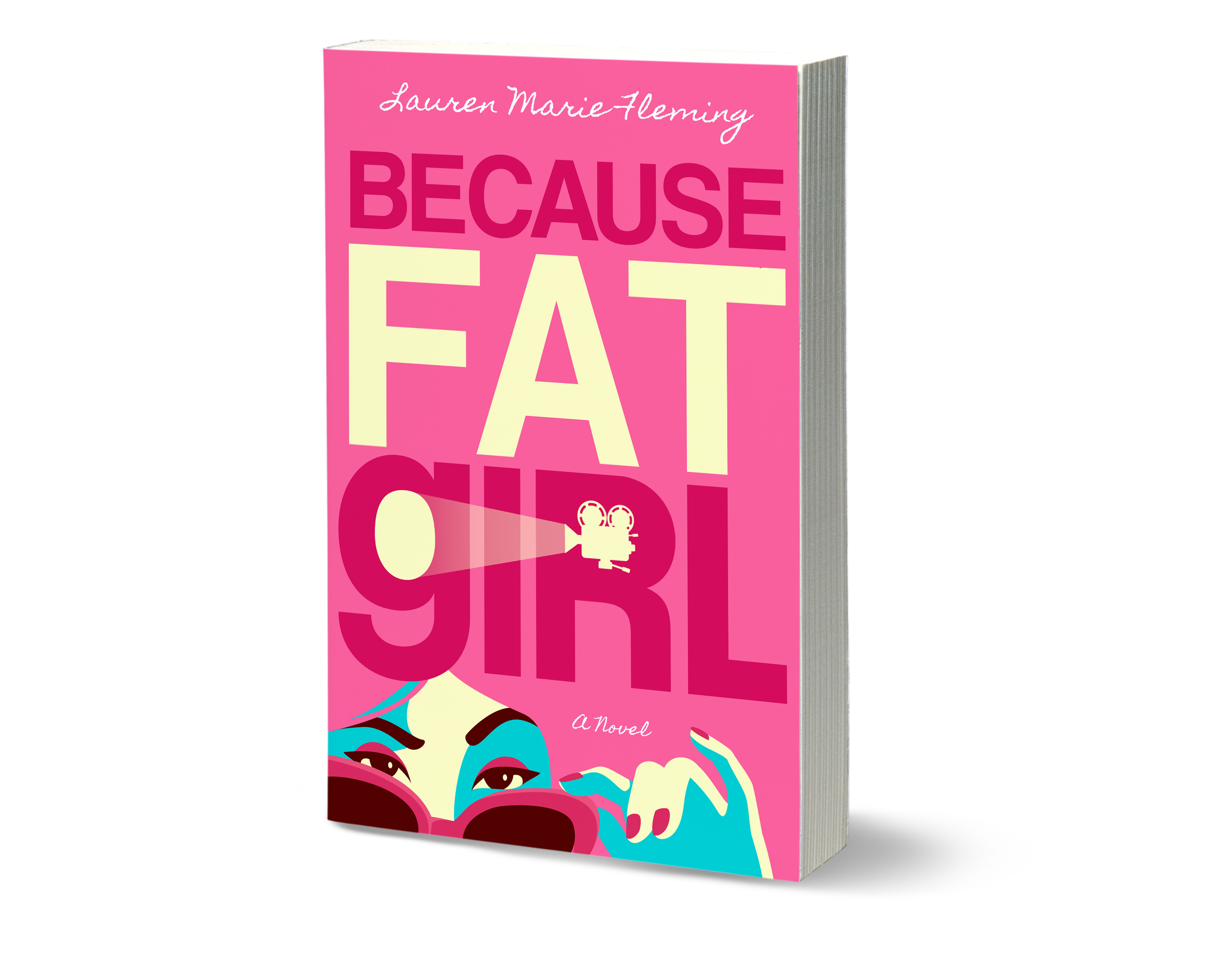
Sigh. Isn’t she lovely?
Are you also swooning?
Tell me everything you love about her! Don’t hold back! She, like me, loves praise.
Luckily, I’m polyamorous and she’s got so much love to give this world, so I’m willing to share her beauty with all of you.
If you want to take her home with you after her debut on October 22, here are the links to grab a copy:
Bookshop.org – Buy from your local independent bookstore through this site! Supporting local and independent helps diversify publishing.
Even more important than pre-prdering right now, is marking her as “WANT TO READ” on Goodreads. That’s basically like swiping right on her beautiful face.
That shows others that she’s a hot commodity and they should grab a copy now too.
I hope you love this book cover and content as much as I do.
It’s truly an empowering and empathetic book with a diverse cast of characters that will soon be your favorite people in the world.
I can’t wait for you all to meet them.
With love,
Lauren
P.S. Want more behind-the-scenes exclusive looks and sneak peeks before everyone else? Go to BecauseFatGirl.com and become a BFG Insider!
This is so cool. I loved getting to see the process and transitions between mock-ups. The final cover is PERFECT.
Proud of you! Congratulations!!